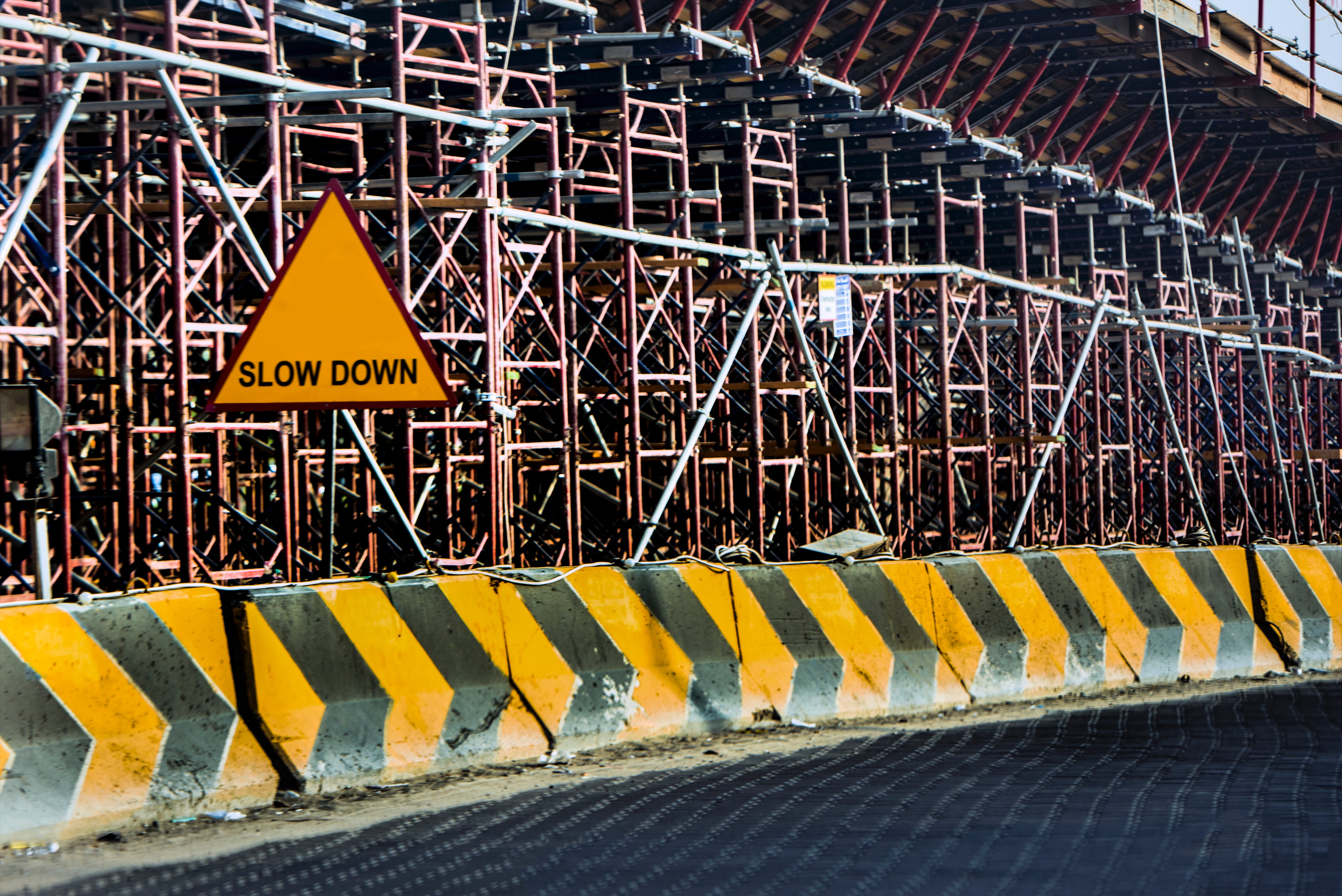
Have you noticed how different types of safety signs have universal colours and shapes associated with them? For example, mandatory action signs are blue with white font, and red signs usually depict prohibition.
Different colours and shapes are used to signify different types of warnings ahead so that individuals can identify a hazard at a glance. To make signs as easy as possible for your employees to understand, you should stick to universal safety signs colours and shapes. But what’s the scientific reasoning behind choosing these colours?
Best Colours for Signage
People perceive red and orange as the most intense colours, which is why they’re often used for signs that depict danger and warnings, like stop signs. Less visually disruptive colours are used for safety signs that aren’t as strongly associated with immediate physical danger, like how blue is often used for hygiene signage.
Red and yellow are usually used when immediate attention is needed. So why do our brains respond so strongly to these colours?
Red
Red is typically used for prohibition and warning signs for several reasons, one of which is that it’s the most resistant colour to a phenomenon of light called scattering.
Red is the colour with the highest wavelength, so it’s scattered the least when light needs to pass through smoke or fog. This makes it the most visible colour in most conditions, and from the furthest away. It’s also the colour that we associate with natural dangers, like fire and blood, making it a colour that usually stands out to us in our environment.
Yellow
Although red is used for warning and prohibition signs, yellow is the standard for hazard signs. This is because yellow is the first colour that the human eye can notice, particularly in contrast to something dark. Black and yellow are a common colour combination of poisonous animals, so we instinctively perceive this as something dangerous – this is why hazard signs are typically yellow with black text and pictograms.
Best Placement for Safety Signs
Now that you know which safety signs are the best for getting people’s attention, where’s the best place to put them?
The best place to put a safety sign is somewhere that’s easy to spot and relevant to the hazard. It should be close enough to the hazard that it’s clear where the danger is, but not so close that the individual is already in the dangerous area before they see it. It’s also a good idea to place them at the average eye level, which is identified as 44” above the ground.
Avoid Information Overload
It’s important to deliver a clear message with your safety signage. Having too many different safety signs together can be an overload of information and cause more confusion for your employees.
Your signage needs to convey a concise message so that employees can immediately recognise the risks ahead. For example, if you have the same hazard at several points throughout your site, you should consistently use the same signage to mark it. This will make recurring hazards much more easily recognisable for your employees.
Learn More with Label Source
At Label Source, we’re committed to providing you with all the labels and safety signs you need, as well as the right information about them, to create a safe workplace for you and your employees.
Browse our safety signs to see how we can help you, or get in touch with a member of our team today.