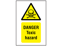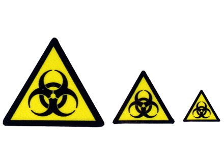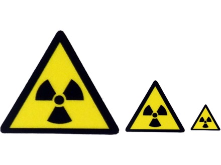
Certain hazards signs, along with their meanings and designs, have embedded themselves in popular thought through their prominence in media, world events and, generally, provocative designs. These three labels – the skull and crossbone, the biohazard four circles and the radiation tri-foil – are the most famous, allowing them to be some of the most well-recognised hazard signs and meanings.
Danger: Skull and Crossbone
Since as far back as the twelfth century, the skull and crossbone has been used to warn others of danger or ferocity. Originally used for military flags and insignia, it was soon associated with piracy and had developed into its current form by the fifteenth century.
Throughout the years, the symbol was quite often used on the entrances of graveyards. However, in the nineteenth century, it was adopted as a warning for poison or other dangerous substances, replacing previous symbols, such as +++ and drawings of skeletons. This came to prominence thanks to a New York State requirement in 1829 for all containers holding poisonous substances to be labelled.
In a stroke of strange local news, the sign was adopted by Cardiff Rugby Football Club in 1870 for use on their uniforms, before being removed following a campaign by the players’ parents.
Variants of the skull and crossbone label were used throughout the early twentieth century, causing conflicting issues behind the hazard sign’s meaning.
In 1986, a study in the University of Alberta determined that the most effective variant of the sign was one that is similar to the one we see today: a white skull and crossbones in a black triangle. While the modern variant differs, the study spoke volumes for the importance of having universal and recognised hazard signs and meanings.
Biohazard Tape

The creative brief for the biohazard label read as follows: “memorable but meaningless”. This was the task chemical company Dow Chemical had to follow in 1966 when designing a new label for their containment products. Following its huge success, Science declared the sign as the gold standard for biological hazards in 1967, sparking a love affair with scientists and zombie-aficionados alike.
Before that, biohazard labels were not effective, bordering on impotent. The US Army labs employed an upside-down blue triangle in the early 20th century, while the Navy chose a pink triangle. The Universal Postal Convention tried pushing for a white staff-and-snake with a violet background. Thankfully, Dow recognised that this lack of proper universality in hazard signs and meanings was causing problems.
Pinning down what made the biohazard label so immediately recognisable, even one year after its debut in 1967, is tough, but its spiky, sharp design may have something to do with it.
Radiation

Alongside the above tapes, the radiation sign is easily recognised. The symbol was driven in the wider consciousness during the Cold War, plus modern disaster, superhero and war films of all descriptions tend to centre on a nuclear threat or origin of some description.
The life of this “tre-foil” design came from, once again, the United States at the University of California, Berkeley in 1946. The symbol originally came via a doodle by a research group, who wrote that the logo was meant to represent energy coming out of an atom.
Things went quiet on the radiation front for two years when, in 1948, Brookhaven National Laboratory requested a symbol of standardised colours for use in radiation safety.
The original designs were completely different to what we see today, with the sign having a blue background with a fuchsia symbol. This background was changed to yellow by the Oak Ridge National Laboratory the same year. The symbol is still fascia in the US today, with Europe opting for a black and yellow colour scheme.
How Well Do You Know Your Hazard Symbols?
Hazardous signs and their meanings are incredibly important as science moves forward. As with most industries, the world of labels moves fast. Be sure to keep up with Label Source’s news blog and hazard sign product pages for the newest information on all things labelling and safety.